You’ve probably heard the phrase “a picture is worth a thousand words.” Well, color is one of the loudest voices in that image. Long before anyone notices your subject, your composition, or your lighting, they feel the color. It sets the tone, stirs up emotion, and often decides whether someone pauses to look or scrolls right past.
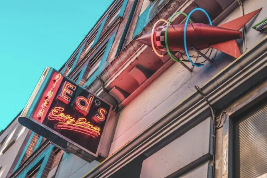
No matter what subject or style you’re shooting, understanding how color psychology works can take your images from just nice to jaw-dropping. This guide explores how and why certain colors affect us, and how you can use them to tell better visual stories.
The Basics of Color Psychology
Let’s start simple with Color theory 101:
- Primary colors are red, blue, and yellow. These are the pure building blocks of all other colors. You can’t create them from other hues.
- Secondary colors are made by mixing two primary colors: red + blue makes purple, blue + yellow makes green, and red + yellow makes orange.
- Tertiary colors are the blends between a primary and a neighboring secondary color like teal (blue + green) or magenta (red + purple).
The color wheel is a helpful tool that shows how these colors relate. When used intentionally, the relationships between colors, like contrast or harmony, can dramatically influence the feeling and composition of your photo.
Psychological Associations of Certain Colors
But color isn’t just visual, it’s psychological. Here’s a more colorful and concise breakdown of what each shade tends to say:
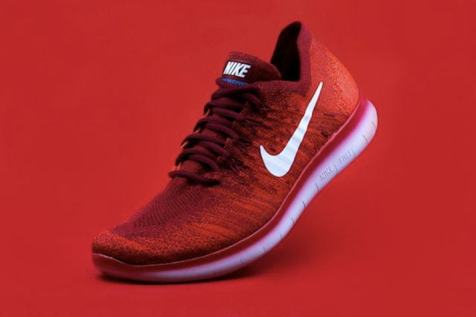
- Red feels intense, like adrenaline or a fast heartbeat. It screams passion, love, heat, and danger. A red dress in a sea of gray pulls the eye instantly. Use red to add excitement to an image.
- Blue calms you down, like deep water or a clear sky. It speaks to peace, trust, and sometimes loneliness. It’s great for introspective or serene scenes.
- Yellow buzzes with energy. Think of sunshine, joy, and playfulness, but too much can feel loud or even anxious. It’s cheerful and eye-catching.
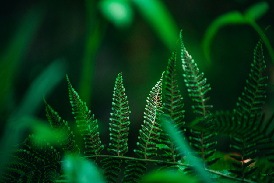
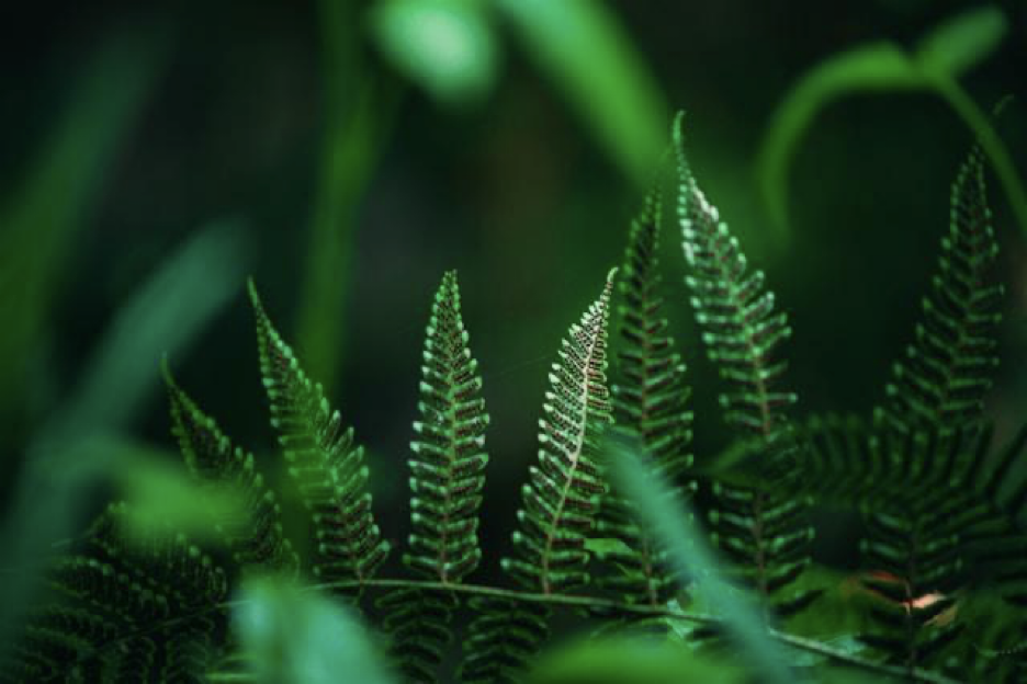
- Green is grounding. It evokes nature, renewal, and balance. A lush forest or even just a pop of greenery adds a feeling of growth and life.
- Orange is warm and fun like a cozy sweater or a crackling campfire. It brings excitement, friendliness, and a sense of adventure.
- Purple feels rich and dreamy. It hints at luxury, mystery, and creativity. Use it for surreal, moody, or magical vibes.
- Black and White are timeless and dramatic. High contrast in black and white photos adds weight and clarity to the emotion of a scene.
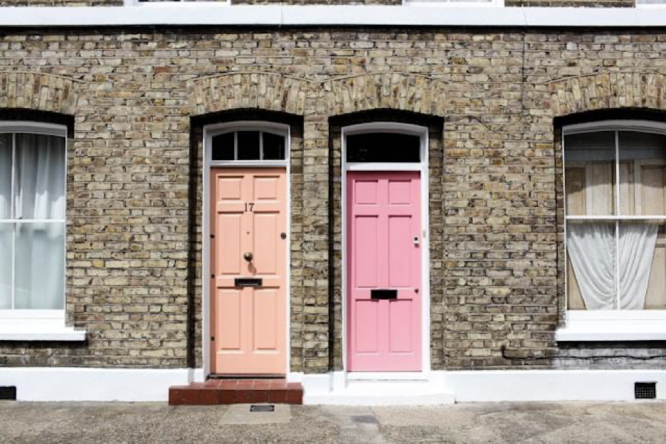
- Pink can be soft and romantic or bold and playful. A pale blush whispers innocence; hot pink demands attention.
These are broad strokes, of course, but useful ones. And here’s where it gets interesting…
Influence of Colors in Photography
Color doesn’t just sit there looking pretty, it speaks directly to your viewer’s subconscious.
Warm colors (reds, oranges, yellows) tend to energize a photo. They draw the eye in and create a sense of heat or urgency. Cooler tones (blues, greens, purples) feel calmer and more introspective. They can make a photo feel serene, isolated, or ethereal.
But be mindful. Color interpretation isn’t universal. In Western cultures, white often symbolizes purity, while in some Eastern cultures, it represents mourning. Red might signify danger to some, celebration to others. So always consider your audience.
Here are a few iconic examples where color changed everything:
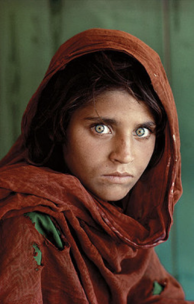
Steve McCurry’s “Afghan Girl”: The vivid red scarf behind her pulses with intensity and urgency, immediately grabbing your attention, while her green eyes offer a piercing sense of life, renewal, and resilience. The contrast between the two colors creates emotional tension and depth, telling a powerful story before you even notice the details of her expression.
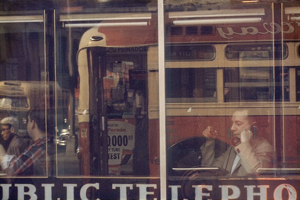
Saul Leiter’s street photography: His use of soft, faded pastels wraps each scene in a sense of nostalgia and quiet intimacy. These gentle colors feel personal, almost like memories, creating mood through subtlety rather than bold statements.
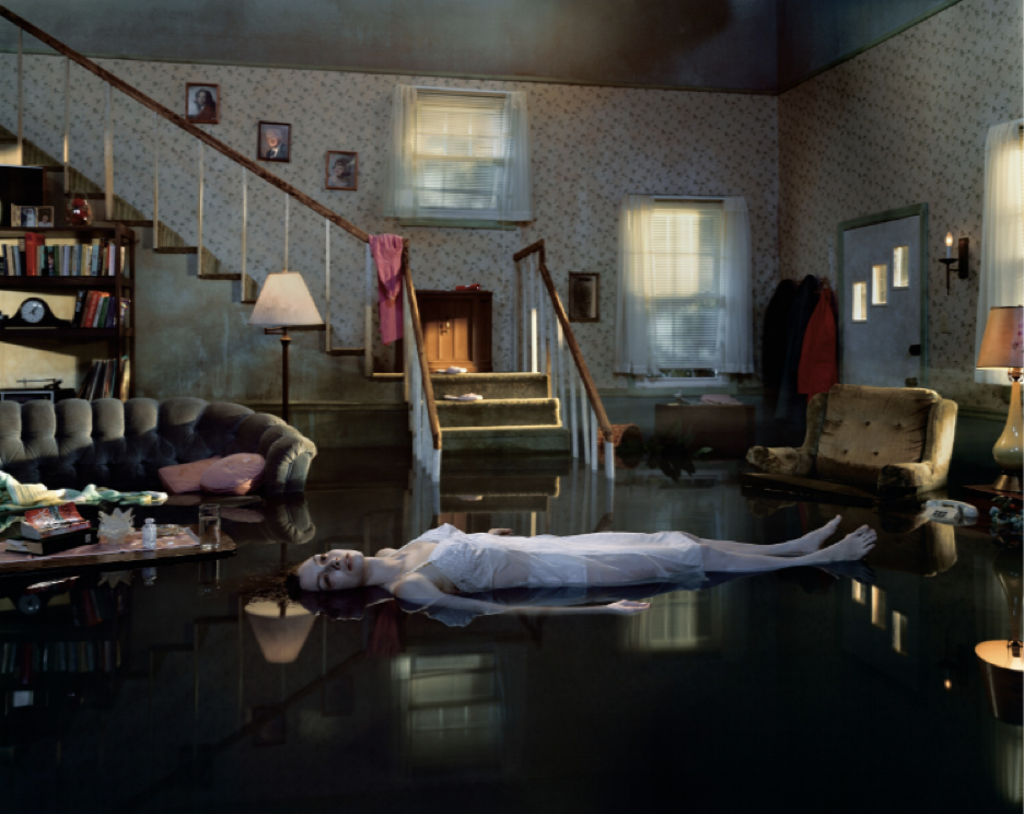
Gregory Crewdson’s cinematic scenes: His cool blues and muted tones build an eerie stillness, evoking isolation, mystery, and suspense. These desaturated palettes make the viewer feel like they’ve stumbled into a dream or a haunting moment frozen in time.
Using Color to Shape Perception and Narrative
So how do you use color with purpose? Start by thinking about the story you want to tell or the feeling you want to create. If you want your viewer to feel energized, use bright, warm, saturated tones. When you want something more melancholic, go for cool, desaturated hues.
Here are a few pro tricks:
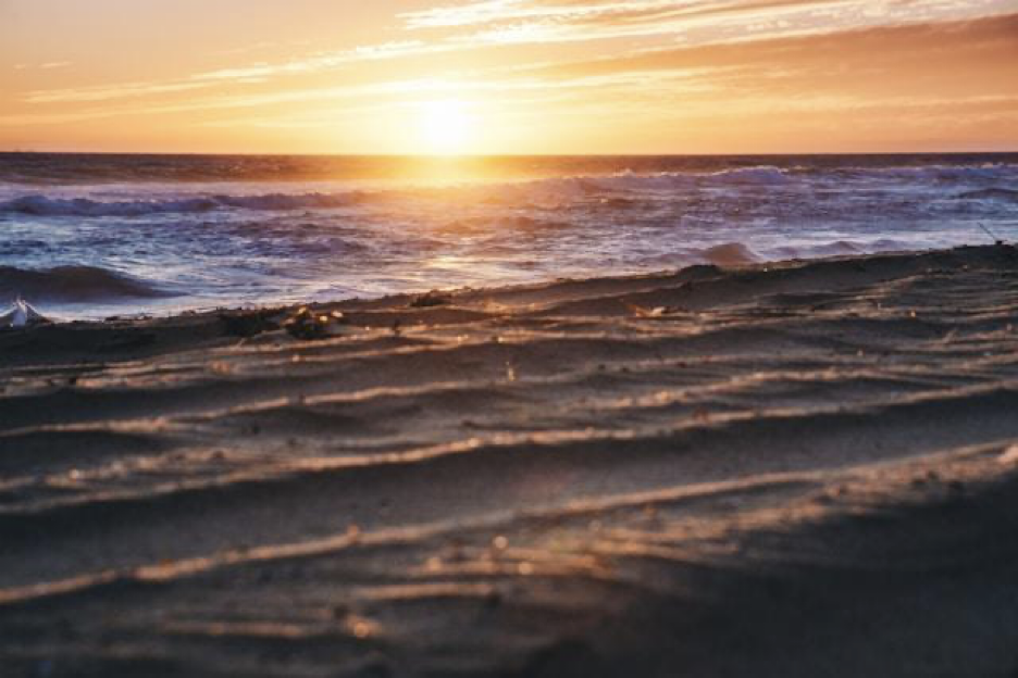
Complementary colors are opposite each other on the color wheel like orange and blue, or red and green. When used together, they create strong contrast and visual tension. Think of a sunset sky against a deep blue ocean or a red umbrella in a green field: bold, eye-catching, and packed with energy. They are great for drama or high-energy shots.
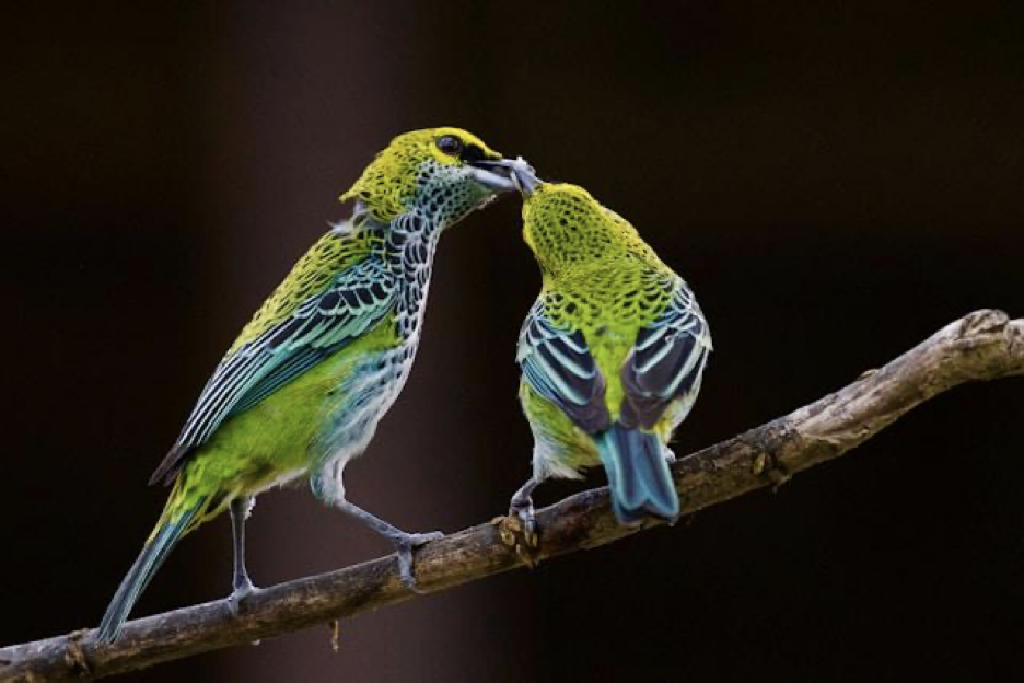
Analogous colors sit side by side on the color wheel like green, teal, and blue. Because they’re closely related, they create a soft, natural flow that feels peaceful and balanced. You’ll often see them in nature, like leaves against the sky or ocean waves blending into the horizon. These colors are well-suited for nature or lifestyle imagery.
Monochromatic palettes use variations of a single color in different shades, tints, and tones. This creates a unified look that can be calming, dramatic, or moody depending on the color you choose. It’s a great way to focus on texture, shape, or emotion without the distraction of clashing hues.
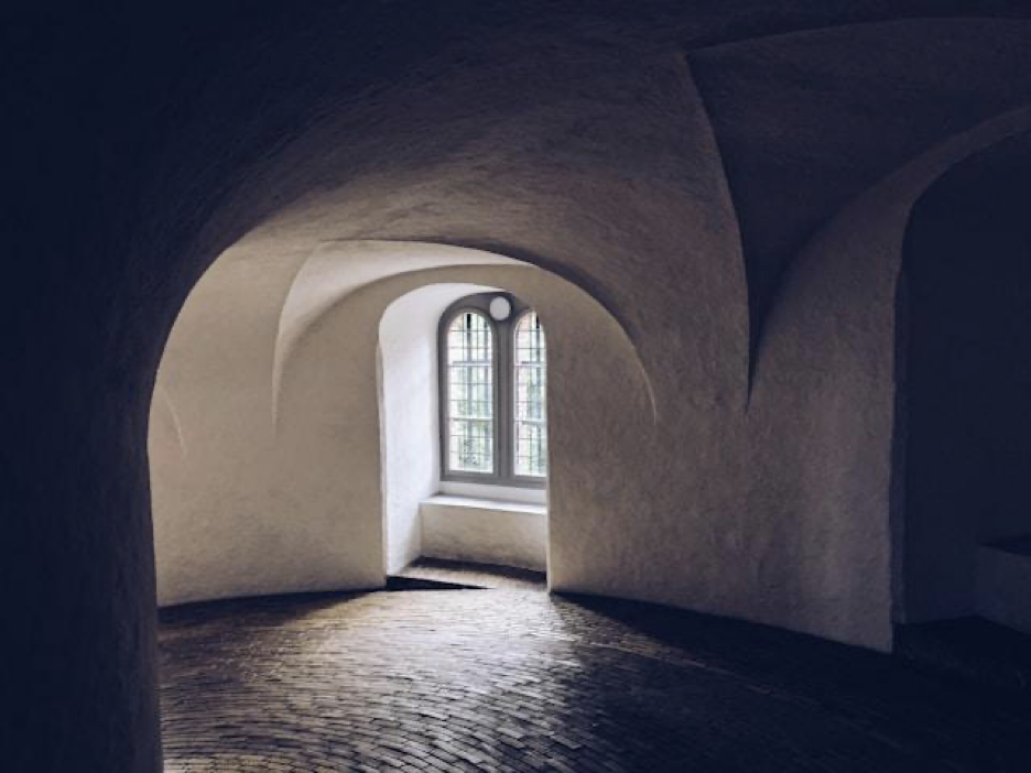
Also, don’t overlook the role of saturation and contrast. Muted colors can feel vintage, dreamlike, or somber. High contrast and vibrant hues feel more modern, bold, or intense.
Practical Tips for Photographers
Here are a few ways to scout and use color more effectively:
1. Scout with color in mind
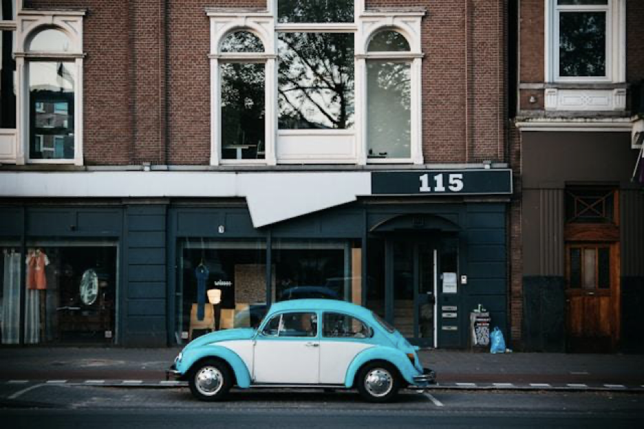
Train your eye to notice color wherever you go. Painted walls, weathered signs, or pops of color in clothing can add mood or narrative to a shot. In natural settings, seasonal changes, wildflowers, or even overcast skies can give you incredible color opportunities you might overlook at first glance.
2. Use light to enhance color
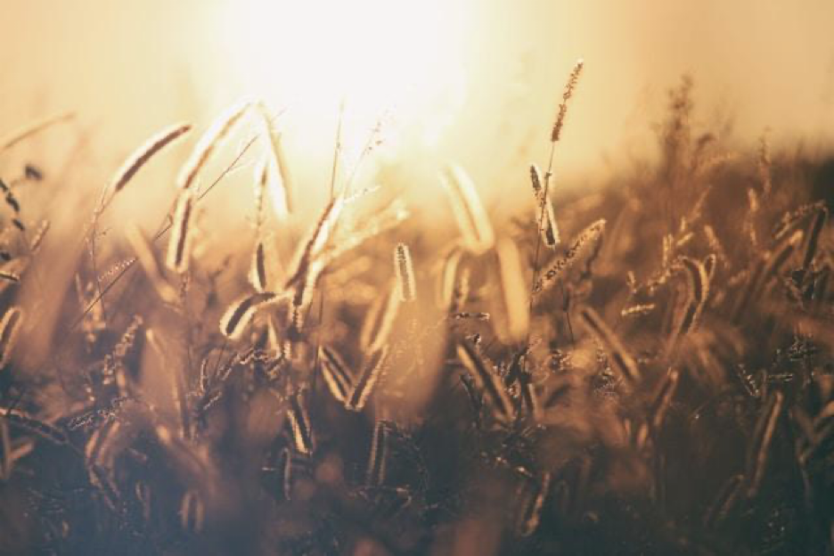
Light completely changes how color appears in your photos. Warm, golden-hour light adds richness and romance, while blue hour feels cooler and more mysterious. Overcast skies create soft, diffused light that helps colors pop without harsh shadows, and backlighting can make translucent colors, like leaves or fabrics, glow from within.
3. Post-processing matters
Editing is where you can really push color to match the emotion you’re aiming for. Adjusting hue and saturation can intensify or mute the mood, and color grading can bring a cinematic quality to your image. But tread carefully because over-processing can make your photo feel unnatural or overly stylized unless that’s your goal.
4. Watch your color balance
If your colors feel off, the entire mood of your image can suffer. Pay attention to how colors interact and whether they feel cohesive or chaotic. Use a limited palette if you’re unsure, and always ask, “does this color story support the emotion I want to convey?”
5. Be mindful of your subject’s wardrobe
What your subject wears can make or break the composition. Bold, contrasting colors can help them pop against the background, while overly similar tones can cause them to blend in. Guide your models or clients on color choices that complement the location and the mood you’re aiming to capture.
Case Studies: When Color Makes the Shot
Let’s break down a few examples of images that use color as the emotional engine of the photograph, shaping mood, telling story, and guiding the viewer’s experience.
1. William Eggleston’s ‘The Red Ceiling’
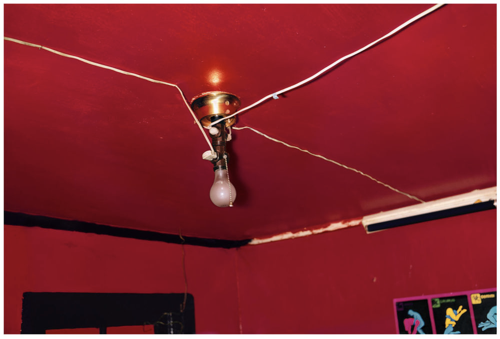
This arresting photo of a glaring red ceiling, punctuated by a bare lightbulb and a tangle of cords, is more than just a picture of a room, it’s a psychological experience. The deep, saturated red completely dominates the frame, creating an atmosphere of tension, discomfort, and emotional intensity. It feels confined, even aggressive, forcing the viewer to sit with the unease that the color evokes. Eggleston used red not as a detail, but as the subject itself. This photo is a perfect example of how bold, intentional use of color can turn the mundane into something unforgettable and emotionally charged.
2. Saul Leiter’s ‘Taxi, New York 1957’
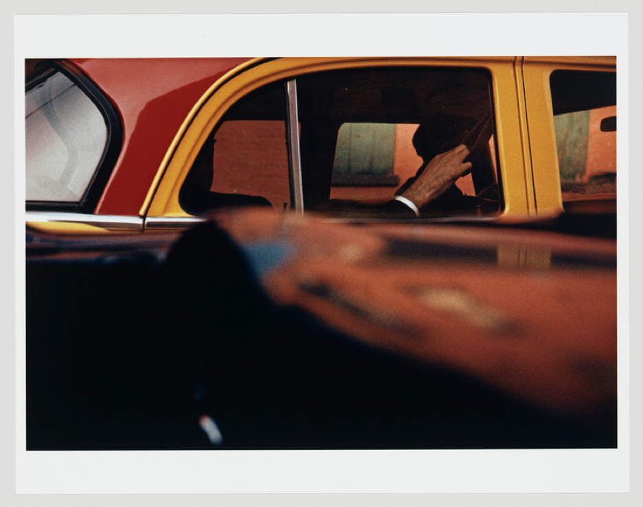
Leiter’s dreamy, painterly photo of a passenger in the back of a red and yellow taxi, glimpsed through a window is a masterclass in emotional color storytelling. The warm yellows bleed softly into muted reds and hazy reflections, creating a feeling of quiet observation and wistful distance. The shadows and reflections add texture and depth, enhancing the sense of separation between viewer and scene. It feels as if you’re remembering a moment rather than witnessing it in real time. The color palette here isn’t just beautiful; it conveys emotion in a way that words can’t.
3. Todd Hido’s ‘House Hunting’ Series
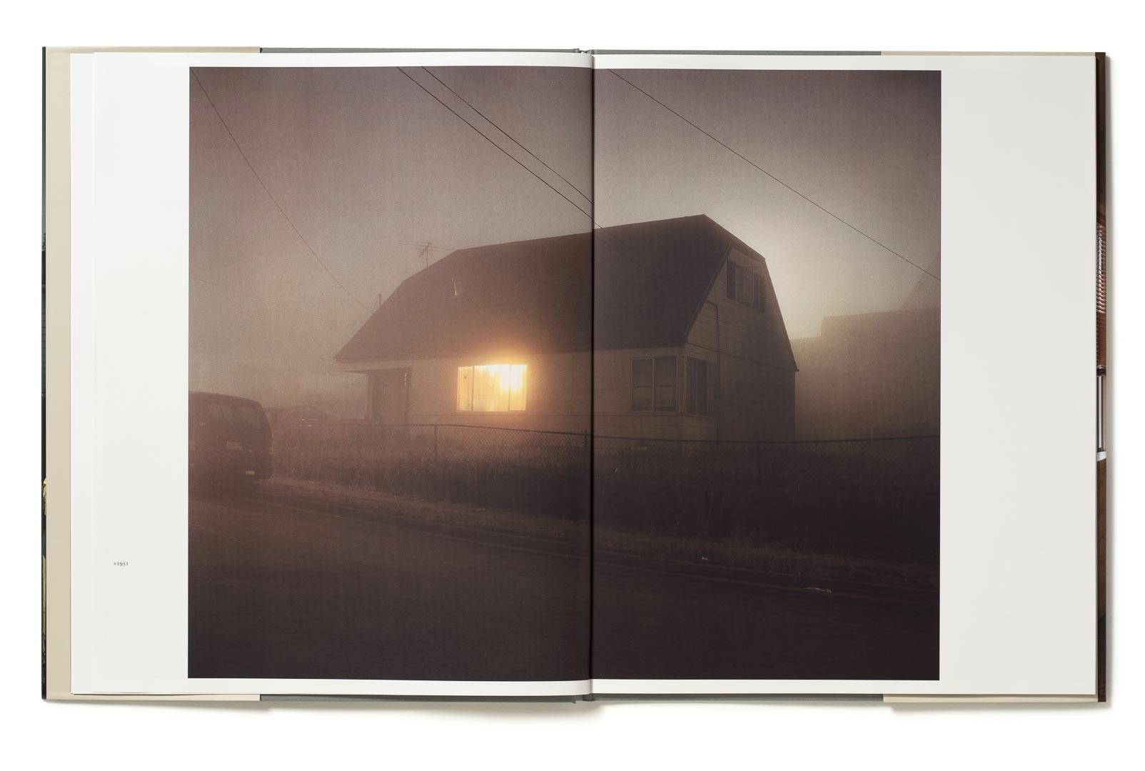
Todd Hido’s haunting suburban landscapes in his House Hunting series are a lesson in how using cool, subdued colors can create mood and add emotional weight to your images. One standout image shows a lone house glowing faintly against a vast, dark sky, almost entirely desaturated except for the warmth from a window. The cool tones evoke loneliness, quiet mystery, and a sense of detachment. His muted palette feels cold and cinematic, creating a visual atmosphere that’s both beautiful and unsettling. Hido’s series proves that sometimes it’s the absence of bold color that speaks the loudest, inviting viewers to sit with the silence and read between the lines of light and shadow.
Start Seeing Color Differently
Once you start tuning into color psychology, you won’t be able to unsee it. Every scene becomes a potential color story. Every frame is a mood board. Pay attention to the emotional cues that color gives you and your viewer.
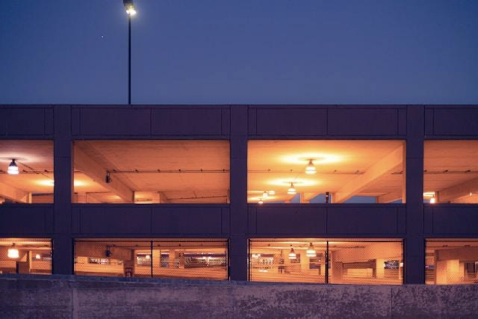
Try shooting a photo with a specific color emotion in mind. Maybe it’s calming blues, romantic pinks, or fiery reds. Edit it intentionally. Then share it and ask people how it made them feel. That’s the magic of color. It doesn’t just show, it tells.
