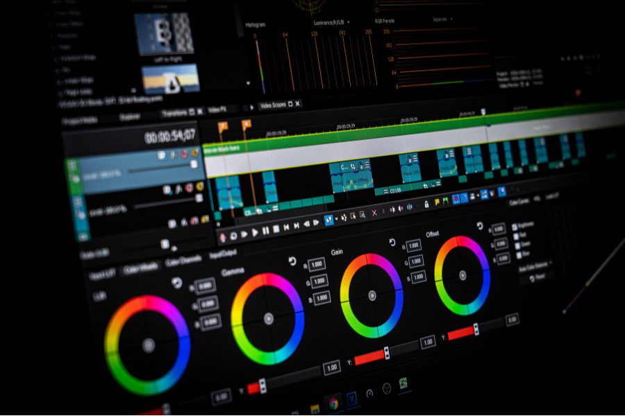
In the realm of visual storytelling, color is a dynamic and transformative force that can breathe life into narratives, evoke emotions, and transport audiences into different worlds. It’s the palette with which filmmakers, directors, and videographers paint their stories, infusing scenes with meaning, mood, and atmosphere. This profound influence of color is where the art and science of storytelling in videography come to life.
Imagine a film that shifts from the warmth of a summer day to the chilling coolness of a winter’s night, all through the subtle manipulation of color. Or a music video that pulsates with vibrant hues, amplifying the beat’s intensity and rhythm. These cinematic experiences are not accidents; they are meticulously crafted through the mastery of color grading.
In this article, we embark on a journey into the heart of color grading in videography. We’ll explore its rich history, the essential tools of the trade, and its profound influence on the art of cinematic storytelling. Get ready to unlock the secrets behind those mesmerizing visuals that captivate your senses and transport you to new worlds.
Palette of Emotions: Delving into Color Theory
Color grading is the magical process that bridges the gap between raw footage and cinematic excellence. It’s the digital darkroom where videographers, like modern-day sorcerers, enhance, adjust, and fine-tune colors to align with the emotional resonance of their stories. Whether it’s the warm, golden tones of a nostalgic flashback or the moody, desaturated palette of a dystopian future, color grading plays a pivotal role in creating the visual language of a video.
But color grading is not just about aesthetics; it’s about storytelling. It’s about conveying emotions, guiding audiences’ reactions, and immersing them in the filmmaker’s vision. It’s the difference between a bland visual narrative and a vivid, unforgettable cinematic experience.
Understanding color theory is essential for any videographer seeking to master the art of color grading. Colors profoundly impact emotions and storytelling, making them a powerful tool in visual narratives.
Warm colors like red, orange, and yellow can evoke feelings of passion, energy, and warmth. They are often used to convey excitement, love, and enthusiasm. In color grading, enhancing warm tones can infuse scenes with vitality and intensity.
Cool colors such as blue, green, and purple have a calming and soothing effect. They are often associated with tranquility, sadness, and mystery. Manipulating cool tones can set the mood for serene or melancholic scenes in your video.
Combining colors strategically can create contrast and balance. For example, the contrast between warm and cool colors can highlight specific elements within a frame and emphasize emotional depth. Subtle shifts in color can indicate changes in mood, time, or location, guiding the audience through the narrative.
Understanding the emotional resonance of different colors allows you to use color grading to convey the intended mood and emotions in your videography projects.
From Past to Present: The Evolution of Color Grading
In the early days of filmmaking, color correction was a rudimentary process, often limited to fixing exposure and tint issues using analog methods. It was a time-consuming and painstaking task, with colorists physically manipulating film reels to achieve the desired effect.
Fast forward to today, and color grading has undergone a seismic shift. Thanks to technological advancements, especially the advent of digital filmmaking, color grading has evolved into a precise and versatile art form. Modern color grading software and techniques empower artists to meticulously adjust the colors in each frame, crafting mood, tone, and atmosphere with precision. The role of color grading in videography is no longer just about correcting mistakes; it’s about enhancing the visual narrative and immersing audiences in captivating worlds.
Mastering the Craft: Leading Tools and Software
To embark on your journey of color grading mastery, you’ll need the right tools at your disposal. In the world of professional videography, several industry-standard software options stand out, each offering a unique set of features and capabilities.
DaVinci Resolve: Widely regarded as one of the most powerful color grading software, DaVinci Resolve is a favorite among many professionals. It offers an extensive range of color correction and grading tools, making it suitable for projects of all scales. DaVinci Resolve’s user-friendly interface and comprehensive features make it a top choice for both beginners and seasoned colorists.
Adobe Premiere Pro: As part of Adobe’s Creative Cloud suite, Premiere Pro is a universal video editing platform that includes versatile Lumetri Color tools. This combination provides a robust set of means for color correction and grading. Premiere Pro’s popularity in the industry makes it an essential tool for many videographers.
Final Cut Pro: Editing software designed for Mac users, Final Cut Pro also offers powerful color grading capabilities. On top of that, it’s easy to use. Final Cut Pro’s unique color wheels provide an alternative to traditional controls by combining hue, saturation, and brightness into a single, simple interface, and the new Automatic Color Conform feature lets you instantly tone-map video, still images, generators, and Motion titles — from SDR to HDR or from HDR to SDR.
Avid Media Composer: Avid’s Media Composer is a long-standing favorite in the world of professional video editing. Its color grading capabilities are extensive, and it’s often used in post-production houses and by industry professionals for complex projects.
Choosing the right color grading software is a bit like finding the perfect brush for a painter. Each software has its strengths and unique features, so it’s worth exploring a few to discover which one aligns best with your creative vision and workflow. Besides budget, compatibility, ease of use, and the range of tools offered, consider also the resources available for learning to master the software. Ultimately, the right software is the one that empowers you to turn your artistic vision into reality. So, don’t hesitate to try out a few options and find the tool that feels like an extension of your creative instincts.
Behind the Scenes: The Step-by-Step Process of Color Grading
Now that we’ve set the stage, it’s time to delve into the heart of color grading and provide you with a step-by-step guide to create captivating visuals that breathe life into your stories. Whether you’re a seasoned professional or just beginning your journey, these essential color-grading steps will empower you to shape your cinematic narrative with precision and creativity.
1. Create a Color Palette
- Before all else, create a consistent color palette for your video. Define the mood and atmosphere you want to convey. Are you aiming for warmth and nostalgia, or perhaps a cool, futuristic vibe? This step is better completed even before the shooting starts. It establishes a framework for the entire color grading process, a set of rules for yourself to follow. A well-thought-through color palette ensures you transform your visuals into a work of art. It eliminates the guesswork and speeds up the whole color-grading process.
2. Color Correction
- Once you have a clear understanding of what you want to achieve, start with color correction, the foundational step where you correct any technical issues such as exposure, white balance, and contrast. Ensure that your video serves as a clean canvas upon which you’ll later apply your creative strokes.
3. Establish a Mood
- Now comes the creative part. According to the mood and atmosphere you want to convey, adjust the color temperature, saturation, and contrast to align with your vision. Always keep an eye on your color palette.
4. Create a Consistent Look
- Consistency is key in storytelling. Establish a consistent color throughout your video to enhance the visual flow. This involves balancing colors and tones across various scenes and shots.
5. Fine-Tune Individual Shots
- Zoom in on individual shots and scenes, giving each the attention it deserves. Adjust colors, highlights, shadows, and mid-tones to bring out the desired emotions and aesthetics.
6. Enhance Skin Tones
- If your video features people, pay close attention to skin tones. Achieving natural, pleasing skin tones is essential. Use specialized tools to refine and beautify skin without losing authenticity. For example, DaVinci Resolve includes advanced skin tone controls that make it easier to adjust and refine skin tones. You can fine-tune skin tones’ hue, saturation, and luminance separately from the rest of the image. DaVinci Resolve also offers a dedicated “Face Refinement” panel within the Color page. This tool is designed specifically for enhancing facial features, including skin. It allows you to soften skin texture, reduce blemishes, and improve overall skin tone. The same can be achieved with Avid’s advanced secondary color correction tools or using various built-in tools and plugins available in and for Premiere Pro and Final Cut Pro.
7. Create Visual Focus
- Guide your audience’s attention by creating visual focus points. Techniques like vignetting or selective grading can draw the viewer’s eye to specific elements within the frame.
8. Experiment with Grading Styles
- Don’t be afraid to experiment with grading styles. Different scenes may require distinct treatments to emphasize their unique qualities.
9. Add Final Touches
- As you near the finish line and prepare to export your beautifully graded video for the world to see, add any final touches that enhance the overall impact of your video. Fine-tune contrast, saturation, and color balance to ensure your video meets your creative vision.
Remember that the art of color grading is not just about following steps but also about honing your artistic intuition. Each video is unique, and your creative choices should reflect the narrative you aim to convey. So, embrace these steps as your roadmap to crafting unforgettable visual stories and let your imagination run wild. In the next sections, we’ll explore advanced techniques and tips to take your color grading skills to the next level.
Navigating Challenges: Overcoming Obstacles in Color Grading
Color grading, while a powerful storytelling tool, can present challenges that require creative solutions and advanced techniques. Let’s explore five common obstacles videographers face during the color grading process and how to overcome them.
1. Inconsistent Lighting
- Footage shot in inconsistent lighting conditions can make color grading tricky. Variations in exposure and color temperature can also disrupt visual consistency. To navigate these issues, apply secondary corrections to problematic areas after completing the first round of color correction to balance exposure and white balance. Consider using power windows or masks to isolate and adjust specific regions with lighting issues.
2. Noisy Footage
- Noise in the footage can be distracting and degrade the overall quality, making color grading more challenging. If you find it difficult to achieve desired results, apply noise reduction filters or test different plugins designed to reduce noise while preserving detail. Use masks if you need to target noise reduction on specific areas like skin, allowing you to retain texture.
3. Limited Dynamic Range
- Footage with limited dynamic range may lack depth and detail in highlights and shadows. When in this situation, utilize HDR techniques to expand the dynamic range. Create a high-dynamic range look with careful adjustments to highlight and shadow regions.
4. Color Matching Challenges
- Matching colors between shots, especially in multi-camera productions, can be daunting. During production, use color charts or color reference charts to maintain consistent color references across cameras. In post-production, use color-matching tools and reference frames to ensure a seamless match between shots.
5. Realism vs Aesthetic Enhancement
- Balancing realism with aesthetic enhancement can be a delicate task. Use subtlety. Be cautious not to overdo it, as it can turn the final footage unnatural and detract from the authenticity of your subject.
Navigating these challenges in color grading requires technical expertise and artistic sensibility. As you encounter obstacles in your color grading journey, remember that each challenge is an opportunity to expand your skill set and bring your unique vision to life. Stay curious, experiment, and embrace the artistry of color grading to elevate your storytelling to new heights. Don’t be afraid to push the boundaries to achieve your desired cinematic look and visual storytelling effect.
Spotlight: Case Studies in Transformational Color Grading
To truly grasp the power of color grading, let’s explore the color grading of some of the popular movies to witness the transformative impact of this essential filmmaking process.
“The Grand Budapest Hotel” (2014) – Wes Anderson
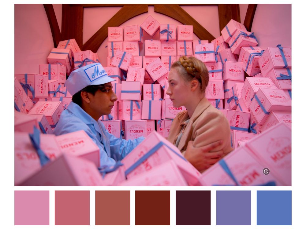
Saoirse Ronan and Tony Revolori in The Grand Budapest Hotel (2014).
Wes Anderson’s films have a signature whimsical charm, which he achieves through meticulous color grading. “The Grand Budapest Hotel” is no different. The film comes to life with a vibrant and fantastical palette. Anderson’s distinctive use of pastel tones and bold color contrasts is brought to the forefront, enhancing the film’s fancy and humor.
“Mad Max: Fury Road” (2015) – George Miller
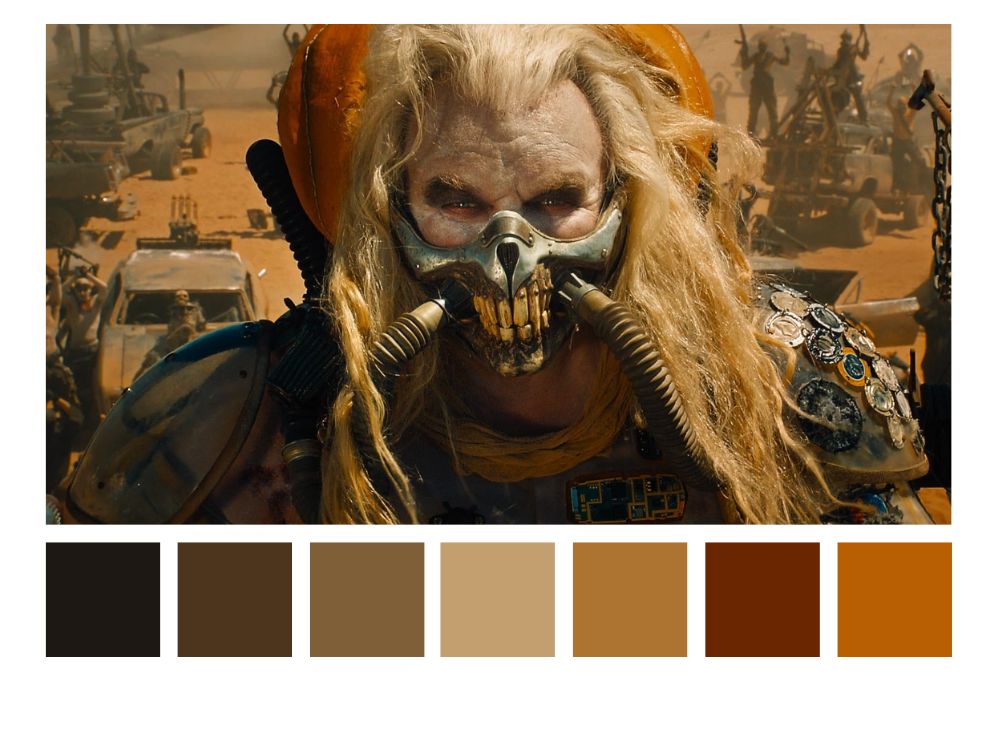
Hugh Keays-Byrne in Mad Max: Fury Road (2015).
Without color grading, George Miller’s high-octane action film “Mad Max: Fury Road” would just offer a glimpse into the harsh desert landscape with no intense, apocalyptic atmosphere. Color grading transforms the footage into a fiery, post-apocalyptic world. The use of high-contrast grading and the enhancement of red and orange hues contribute to the film’s relentless intensity.
“The Revenant” (2015) – Alejandro González Iñárritu
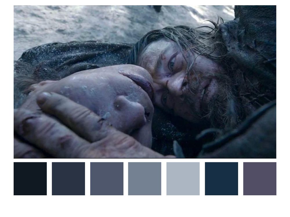
Leonardo DiCaprio and Forrest Goodluck in The Revenant (2015).
Through a combination of cold-blue grading and careful adjustments, “The Revenant” by Alejandro González Iñárritu immerses viewers in the brutally freezing, unforgiving atmosphere of the story. The color grading enhances the film’s stark realism, emphasizing the harshness of the environment.
“La La Land” (2016) – Damien Chazelle
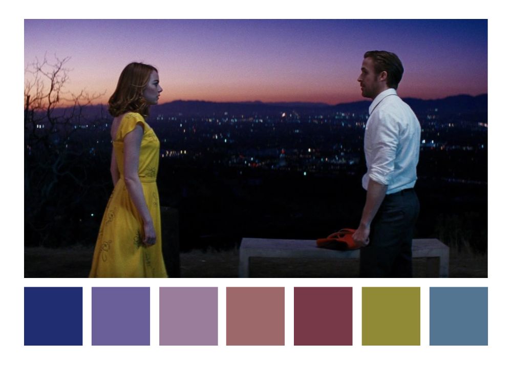
Ryan Gosling and Emma Stone in La La Land (2016).
Damien Chazelle played with rich, golden hues and soft contrasts to achieve a dreamy, nostalgic warmth for the “La La Land.” The result is a movie with a unique vintage touch evoking a sense of fantasy. All enhancing the film’s musical and romantic elements.
Final Words: The Role of Color Grading in Videography
Color grading isn’t just a technical process—it’s an art form. It’s the magic that breathes life into stories, evokes emotions, and transports audiences to new worlds. From transforming mundane footage into cinematic wonders to elevating realism into the extraordinary, color grading empowers you to unleash your creative potential. It’s where your vision meets your audience’s hearts, where storytelling transcends the screen.
So, embrace the art and science of color grading with enthusiasm. Dive into its intricacies, explore its endless possibilities, and use it to transform your videos into unforgettable visual tales. With each stroke of color, you have the power to captivate, inspire, and leave a lasting impression. Let your creativity soar, and let color grading be your brushstroke on the canvas of storytelling.
Unlock Your Creative Potential with ProGrade Digital
As you embark on your journey to master the art of cinematic storytelling through color grading, ensure that your creative tools are up to the task. ProGrade Digital offers a range of high-performance memory cards and workflow readers designed to empower filmmakers and videographers like you. Explore ProGrade Digital’s innovative solutions today and experience the difference in your videography projects.
