Introduction: The Symphony of Colors in Photography
Colors possess their own language in the realm of photography, conveying emotions and shaping the narrative of the image. A whisper of blue might evoke feelings of melancholy or serenity, while a burst of red could signal danger or passion. Colors are not just mere decorative elements; they function as a powerful psychological tool that can dramatically impact the viewer’s perception and interpretation of an image.
Mastering color in photography, therefore, requires both an intuitive understanding of color’s emotional resonance and a technical grasp of color management. This entails knowledge of the color wheel and color theory, the ability to create pleasing color harmonies, and the understanding of color temperature and calibration. By properly managing colors and understanding their interplay, photographers can create consistent, striking images that tell vibrant stories. This guide is an exploration into these areas, unlocking the power of color in your photography.
Back to Basics: Unraveling the Color Wheel and Color Theory
The color wheel, a circular diagram of colors arranged by their chromatic relationship, is the cornerstone of color theory. It begins with three primary colors: red, blue, and yellow. These colors are fundamental because they cannot be created by mixing other colors. Instead, all other colors originate from these three hues.
Secondary colors are the result of mixing two primary colors. Green, orange, and purple represent secondary colors, each born from the blend of two primaries. Specifically, blue and yellow produce green, red and yellow create orange, and red and blue yield purple.
Tertiary colors, sitting between primary and secondary colors on the color wheel, emerge when a primary color is mixed with a neighboring secondary color. Examples include red-orange, yellow-orange, yellow-green, blue-green, blue-violet, and red-violet. By understanding these basic principles of the color wheel, photographers can begin to craft images with a keen sense of color harmony, enhancing the visual impact of their work.
Harmonious Compositions: Understanding Color Relationships
Color harmony refers to the aesthetically pleasing arrangement of colors, fostering a sense of order and balance in visual composition. In photography, color harmony can enhance visual impact, stirring emotions, and guiding the viewer’s focus. Understanding color relationships forms the backbone of creating color harmony, enabling photographers to select and combine colors in ways that resonate with viewers’ sensibilities.
Complementary color schemes involve two colors that are directly opposite each other on the color wheel, such as red and green or blue and orange. This pairing creates a high-contrast, vibrant look, with each color making the other appear more vivid. However, it is important to maintain balance, as too much vibrancy can make the image hectic and visually jarring.
Analogous color schemes, on the other hand, use colors that are next to each other on the color wheel. This scheme creates a more harmonious and visually soothing effect, as the colors smoothly transition from one to another. For example, a landscape photo might employ an analogous color scheme with various shades of green, yellow, and orange to evoke feelings of tranquility and natural beauty.
Triadic color schemes use three colors evenly spaced around the color wheel, such as red, blue, and yellow. This scheme offers a balanced yet vibrant composition, as the colors are equally dominant and offer a rich visual contrast. Similarly, split-complementary schemes involve a base color and the two colors adjacent to its complementary color, offering high contrast without the intensity of a standard complementary scheme. These color schemes are a great way to inject energy and dynamism into your photography while maintaining visual harmony. Learning to master these color relationships can empower you to leverage the power of color in your photography to its fullest potential.
Setting the Mood: The Nuances of Color Temperature
Color temperature refers to the warmth or coolness of color tones in an image. In photography, it’s measured in Kelvin(K). Warm colors, such as reds, oranges, and yellows, are associated with higher temperatures (above 5000K), while cool colors like blues and greens are associated with lower temperatures (below 5000K). Color temperature can dramatically affect the overall mood of a photograph, which is why understanding it is crucial for photographers.
Manipulating color temperature during the photography process or in post-processing can help invoke different emotional responses from viewers. For instance, a warmer color temperature can create a sense of comfort, coziness, or excitement, making it ideal for capturing portraits, golden hour landscapes, or cityscapes. Conversely, cooler color temperatures can evoke feelings of calm, solitude, or melancholy, making them suitable for blue hour photography, winter scenes, or images intended to elicit a sense of peace or quiet.
Moreover, color temperature works closely with other elements in a photograph, such as lighting and color harmony. By controlling color temperature, photographers can ensure accurate color reproduction, maintain color harmony, and set the desired mood for their images. Mastering the nuances of color temperature is, therefore, a key skill in the art of color management in photography.

Precision in Post: The Science of Color Management
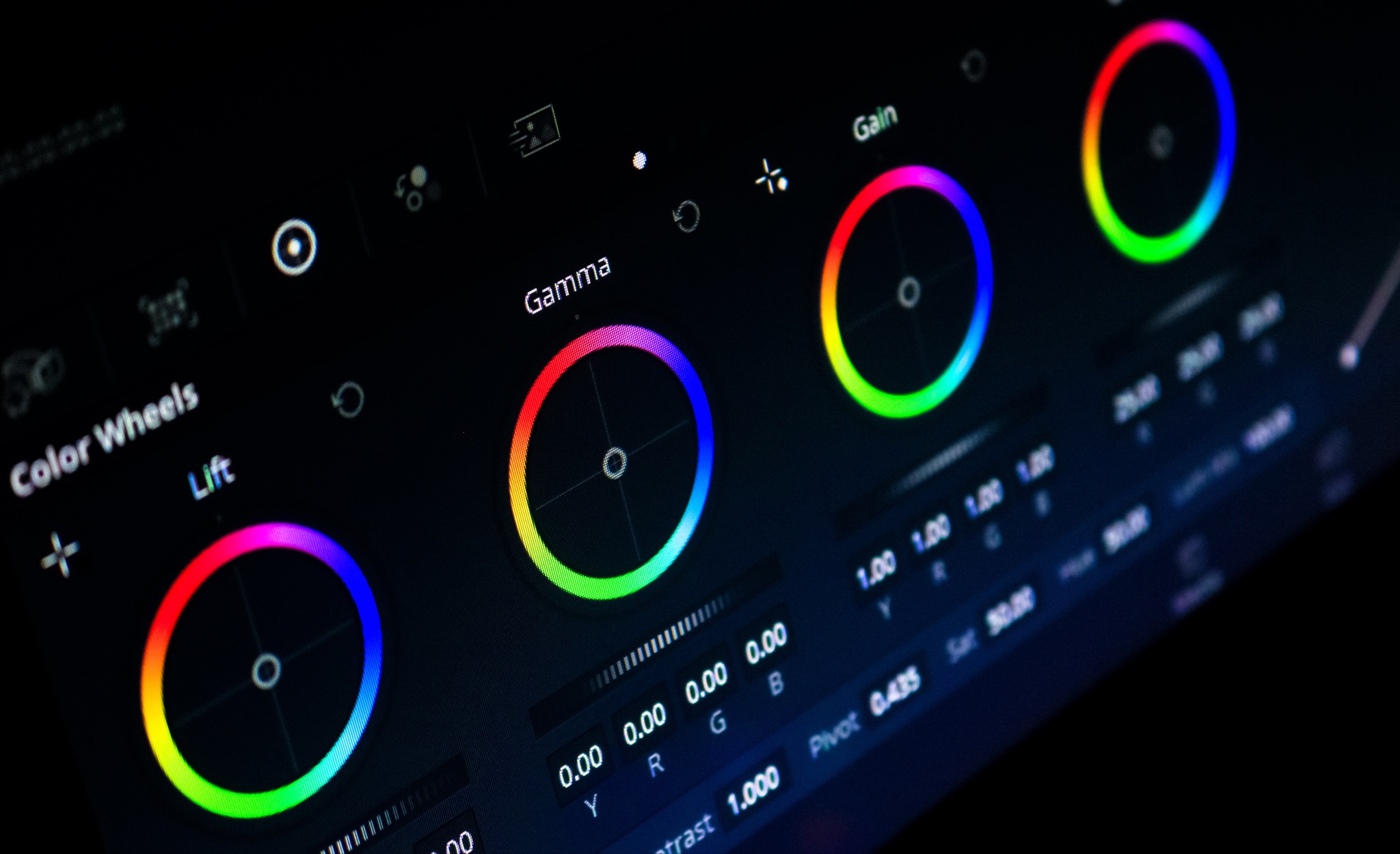
When it comes to post-processing, color calibration is an essential step in the workflow of any photographer, ensuring that what you see on your screen accurately represents the colors in your image. Calibration tools are devices that read and measure the color values displayed by your monitor, creating a color profile that your computer uses to display colors correctly. Without proper calibration, the colors on your screen may appear differently on another device, or when printed, which can lead to inconsistencies and unwanted surprises. Therefore, investing in a good color calibration tool can significantly improve the accuracy and consistency of your color reproduction, elevating the overall quality of your photography.
As photographers, it’s essential to remember that our work will be viewed on a multitude of different devices, from smartphones and tablets to desktop monitors and large-scale prints. Each of these devices interprets and displays colors differently, which can lead to variations in the appearance of your photographs. This is where color management comes into play. By understanding and implementing color management techniques, photographers can ensure that their images appear consistent across various displays. This involves using color profiles, which contain data on how a device reproduces colors, to maintain accurate color reproduction across different devices.
Color profiles play a valuable role in color management. They define how colors appear on different devices, ensuring that the colors you see on your screen are the same when printed or viewed on another display. This is achieved by translating the color data from your image into a language that your device can understand, thereby preserving the original colors and tones in your photograph. Understanding and using color profiles effectively can dramatically improve the final output of your work, providing a consistent color experience for viewers regardless of where or how they’re viewing your images. Mastering color profiles is, therefore, a critical step in mastering color in photography.
Feeling Hues: Deciphering the Emotional Language of Colors
Colors, in their myriad hues and shades, possess a unique ability to evoke an emotional response. The psychology of color is a fascinating area of study that has been gaining prominence in the field of photography. As photographers, understanding the emotional language of colors can aid in creating images that resonate deeply with viewers. For instance, red can invoke feelings of love, passion, or intensity, while blue is often associated with tranquility, peace, and calmness. Yellow, with its bright cheerfulness, can generate feelings of energy and happiness, and green, typically associated with nature, can provide a sense of harmony and balance.
The emotional impact of colors is not merely about the individual colors but also about how they interact with each other within an image. Combinations of colors can create a variety of emotional effects. A photograph dominated by warm tones like red, orange, and yellow can evoke feelings of warmth, optimism, or passion. By contrast, a picture showcasing cool hues of blue, green, and violet might convey an atmosphere of calm, serenity, or mystery.
Hence, as a photographer, understanding the emotional resonance of colors will allow you to predict and manipulate the emotional response of your viewers. It’s about mastering the subtle art of color symbolism and using it to bring your vision to life. This understanding can be a powerful tool in your creative arsenal, enabling you to create visually compelling images that connect with viewers on an emotional level. Mastering the emotional language of colors is an integral part of mastering color in photography.

Brushing Up Techniques: Practical Insights on Harnessing Color
Mastering the use of color in photography is not merely about understanding the theory; it’s also about applying this knowledge in practice. This practical application involves consciously selecting scenes that offer interesting color opportunities, shooting at different times of the day to utilize the varying qualities of light, and utilizing post-processing techniques to fine-tune the colors in your image. Mastering these techniques can dramatically enhance your ability to convey emotion, tell stories, and create striking images.
- Scene selection: Pay attention to the colors present in the scene when composing your image. Look for opportunities to create color contrast or harmony, depending on the mood you want to evoke. Remember, even a mundane scene can be transformed into a captivating image with the right use of color.
- Time of day: The quality of light – and therefore, the appearance of colors – changes drastically throughout the day. Shooting during the golden hour can yield warm, vibrant hues, while blue hour photography offers cool, serene tones. Learn to utilize these variations in light to your advantage.
- Post-processing techniques: Don’t shy away from tweaking the colors of your image during post-processing. Tools like the color balance slider, hue/saturation adjustments, and selective color editing can help you accentuate or downplay specific colors, allowing you to create the perfect color palette for your image.
By developing a keen eye for color and learning to wield it effectively, you can add a new dimension to your photography. This skill, coupled with an understanding of the theory of color and color management, is key to mastering color in photography.
Conclusion: Painting with Light – The Ongoing Journey of Color Mastery
Mastering color in photography is not just a technical skill, but an artistic endeavor that requires exploration, understanding, and practice. It’s about knowing color theory and how colors can sway emotions, making astute scene selections, and applying effective post-processing techniques. It’s about using color to tell stories, to evoke feelings, and ultimately, to manifest your creative vision. There is always something new to learn, a different perspective to consider, or an unseen hue to discover. As photographers, it’s our privilege and responsibility to continue this journey of color exploration, to paint with light and color, and to consistently strive for mastery in color management in our work. Never stop learning, experimenting, and evolving your mastery of color in photography.